Keep Calm and Check Accessibility Week 7: Accessible Tables

When using a table in your document, it’s important to create an accessible one. To create an accessible table, you must use the in-built table tool for it to be accessible. Do not draw a table!

Screen reader users do not see the entire table at once, but instead navigate tables cell by cell. For this reason, the table must be programmed correctly so that the headings are read out when someone enters a cell. In the example table “Dogs’ Age and Weight” when a user navigates to the cell that reads “30 lbs.” the screen reader will announce “Fluffy, weight, 30lbs,” so the person will understand the data in context.

Table 1 Dogs’ Age and Weight

Dog’s Name Age Weight
Fluffy 4 30 lbs.
Spot 2 10 lbs.


If a table is not programmed correctly, a screen reader user will just hear “30lbs” and will not know what it is in reference to.

Similarly, tables should be simple and logical.

Simple: Don’t use split cells or merged cells or merge two tables together. An accessible table should have one header row across (Dog’s Name, Age, Weight) and one header row vertically (Fluffy, Spot) and a simple grid layout. Anything beyond this will be difficult to make accessible to a screen reader.

Logical: Sometimes people use tables to create a specific look or layout to their document rather than to display data. Here is an example:

Grades

A + = 100-95 B = 84-80
A= 95-90 C+ = 79-75
B + = 89-85 C= 74-70


This table is “illogical” because it is not a true table. This table is used to layout information, but not to display data. A screen reader would read the cell that says “C= 74-70″ as “B =84-80, B+=89-85, C =74-70.” In short, it would not make sense to the user. In a case liike this, it is best to list these grades out using a list.

To learn how to make an accessible table, follow these instructions.

Please go to the Keep Calm and Check Accessibility Moodle page and complete the Week 7 activity to get this week’s clue!
Keep Calm and Check Accessibility Week 6: Descriptive Hyperlinks

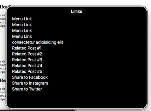
Just as people who use screen readers can skim pages by navigating via headings, so too can they navigate through a document just by links. This picture shows someone using the router feature in VoiceOver (a screen reader). On this webpage the user has used the router to isolate all the links, so then they can use their up and down arrows to go through the list of links to see which link they would like to navigate to.

VoiceOver roter listing the links for a webpage.

If links have vague titles like “click here” or “link” then the screen reader user does not know what the link means, because they cannot see the link in context. Similarly, if links are non-descriptive, long URLs that can be confusing to listen to also.

To sidestep these issues, create descriptive links. For example, instead of https://www.brynmawr.edu/ create a hyperlink that says Bryn Mawr College Homepage.

To create a hyperlink, write the descriptive name for the hyperlink. Then right click on it, click link, and copy and paste the URL in the appropriate box.

Check out this page for more guidance on creating hyperlinks.

To get this week’s clue, complete the activity listed under Week 6 in the Keep Calm and Check Accessibility Moodle page.

Keep Calm and Check Accessibility Week 5: Bulleted Lists vs Numbered Lists

When a person who uses a screen reader approaches a list, the screen reader will announce that there is a list and will announce what kind of list it is- a bulleted or numbered list. For this reason, it’s important to use the in-built bulleted list and numbered list formatting options in Word to make lists. If you try to manually make lists by using hyphens for bullets or by writing your own numbers, the screen reader will not recognize the list and instead will read everything out like a paragraph, which can be confusing for a listener.

Bulleted Lists

Bulleted lists should be used when the order of the items is not important. For example, if you were listing items on a shopping list, these items would be listed using bullets.

Numbered Lists

Numbered lists are for when items must be in a specific order. For example, steps to follow on a recipe card would be listed using numbered list.

Read this article for how to make a bulleted or numbered list in Microsoft Word.

Go to the Keep Calm and Check Accessibility Moodle page and complete the Week 5 challenge to get this week’s clue.

Keep Calm and Check Accessibility Week 4: Alt Text

For people who cannot see pictures well and rely on screen readers to navigate on the computer, it’s important to program the pictures in such a way that the screen reader can explain the content of the pictures aloud.

In order to make images accessible to screen reader users, you must add alternative text descriptions, commonly known as “alt text.” Alt text should be a concise description of the relevant information in the image. Try not to make alt text longer than two sentences. The shorter the better.

To create alt text, follow these instructions.

For decorative images that don’t have significant meaning in relation to the document, don’t write a description. Instead, click the checkbox that says “mark as decorative.” This way, when the screen reader encounters this image, it will skip over it, preventing “verbal clutter” for the listener to weed through.

Here are some extra tips on writing quality alt text.

Head over to the Keep Calm and Check Accessibility Moodle page to complete the Week 4 challenge and get this week’s clue!

Keep Calm and Check Accessibility Week 3: All About Reading

People who might have trouble reading print often use text-to-speech programs or screen readers.

A text-to-speech program is any program, app, or extension that reads text aloud. These programs only read text and will not read out buttons, navigation instructions, or alt text for pictures. Many people use text-to-speech programs including people with low vision, dyslexia, learning differences, and concussions/TBI. Additionally, there are many people without particular accessibility needs who enjoy using text-to-speech to be more productive and streamline their workflow.  On the other hand, screen readers are programs that read out every element on screen and give navigation instructions, with the assumption that the user cannot see anything on the screen. Screen readers are primarily used by people who are blind.

When creating your files, it is important to create them in such a way that people who have varying levels of visual acuity and people who listen to text are able to access all the written information.

Color contrast, font, size, and plain language

When creating a document, it is important to be mindful of how your text appears. The color, font, and size all make a difference in whether someone can read the text or not. Here are some tips to make sure your text is readable.

Color Contrast

It’s important that there is sufficient color contrast between the color of the text and the background so that people with low vision conditions can read it easily. Generally, black text on a white background is a good option, because it is readable by a large population. If you are planning on using different colors, please use a color contrast analyzing tool to make sure that there is sufficient contrast.

Font and Size

It is best to use a san serif font when writing, as these fonts are most accessible. Please avoid any overly ornate fonts that can make it hard to distinguish letters. Additionally, underlining text or using italics can make it difficult for some people to distinguish letters. If you must emphasize a portion of text, using bold letters is the best choice.

It is recommended that font size be above 11 point font to ensure accessibility.

Signifying Important Information

Sometimes people make text bold or a different color to signify important information. However, this is not a good system to use since people who access documents by listening to a screen reader or text-to-speech program will not be able to hear “bold” or “color.”

For this reason, if you need to signify important text, it is important to do so in more than one way. For example, if you write the word “important” and then write the information that is important, a person will be able to hear that read aloud. Likewise, if you write a note that important text will be signified by an asterisk and then use an asterisk to note important text, a person listening will be able to hear the asterisk read aloud.  In conclusion, it is okay to use bold font or colored font to signify importance, but if you do so, you must also have an additional way of noting its importance that a text-to-speech program or screen reader will be able to speak aloud.

Plain Language

Its important to write content that everyone can understand. Highly intelligent people can struggle with reading comprehension for a variety of reasons, ranging from having a learning difference to reading a text in their non-native language. Following plain language guidelines in your writing will ensure that text is as accessible as possible.

For this week’s clue, complete the activity listed under Week 3 in the Keep Calm and Check Accessibility Moodle Page.

Keep Calm and Check Accessibility Week 2: Headings 

To understand accessibility, it is helpful to understand how people who use assistive technology navigate elements on the computer. For example, some people with limited functional vision use a tool called a screen reader. A screen reader reads aloud all the elements on a screen and allows the user to navigate through these elements using keyboard commands.  

Since screen reader users often cannot see the screen, to skim through a document or webpage they navigate by headings, listening to each heading to get a gist of what the article contains. If headings are not programmed correctly, the screen reader will not be able to detect them, and the user will need to listen to the entire webpage read aloud in order to know what is on the screen. This process can be very time-consuming and confusing.  

To best support people who navigate by headings, there are two main things to remember. 

  1. First, make sure that you have correctly programmed the headings in your documents. To do so, highlight your heading, click Styles, and then click the appropriate heading type. Read this article for more information about how to create headings.  
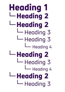
  1. Secondly, make sure your headings are stacked in the right order. There should only be one Heading 1, and that should be the title of your document. The rest of the headings should be labeled in an appropriate sequence without skipping over a heading type. (For example, don’t go from a Heading 2 to a Heading 4, always go from a Heading 2 to a Heading 3 to signify a subheading below the Heading 2 level heading.) The picture below shows a good example of headings arranged properly. 

Picture of headings arranged in the correct order. 

When you create proper headings, you will see a little triangle appear when you hover the mouse over the text. This means that the heading has been programmed. Once the heading is programmed, if you don’t like the automatic font of the heading, you can change it by selecting a new font under Font Name and Font Size. 

For this week’s treasure hunt clue, log onto the Moodle page and complete the activity under Week 2. 

If you have any questions, please reach out to Grace Cipressi.  

Keep Calm and Check Accessibility Challenge: Week 1

What Does it Mean to Check Accessibility?

Welcome to the Keep Calm and Check Accessibility challenge! Throughout our Keep Calm and Check Accessibility challenge, you will learn about the basic elements needed to create an accessible document. We’ll start out by discussing Word documents and then finish by talking about elements specific to creating accessible PowerPoints and PDFs.

Each week, read the LITS blog post explaining the featured accessibility element. Next, log onto the Keep Calm and Check Accessibility Moodle page to complete that week’s activity. When you finish the week’s activity, you will receive a clue. Each clue is a line to a poem that will lead you on a treasure hunt. Solve the riddle in the poem and find where your prize for completing the challenge will be hidden on campus.

To get started, you have two important tasks this week.
  1. Log onto Moodle and self-register for the Keep Calm and Check Accessibility Moodle page.
    1. Click the gear icon
    2. Click enroll me in this course
  2. Complete the challenge listed under Week 1 to get the first clue.

Inside Microsoft Word and PowerPoint, there is a tool called the Accessibility Checker. This tool helps you proofread your document or presentation to make sure it is accessible. To access it, go to Review and then click Check Accessibility. A box will pop up on the right side of your screen and list any accessibility issues found.

To learn more about Microsoft’s Check Accessibility read this article.